How Color Secretly Shapes Your Learning: A Practical Guide
While color alone won’t transform you into a straight-A student overnight, understanding how different hues might influence your mental state could help you create an environment that supports your learning journey. This isn’t about finding magic solutions, but about discovering small adjustments that might make studying feel a bit easier and more effective.
🧠 How We Experience Color: Beyond Simple Vision
When we talk about color in learning environments, we’re discussing something much more complex than simple decoration. The way our brains process color involves multiple systems that influence how we think and feel.
Color perception begins when light wavelengths hit our eyes, but the experience doesn’t stop there. This visual information travels through various brain regions, potentially influencing:
🔵 Our alertness and energy levels
🟢 Emotional responses to study materials
🟡 How easily we can maintain focus
🔴 Our ability to recall information later
What makes this particularly interesting is that these responses often happen without our conscious awareness. We might simply notice that we feel more restless in one room compared to another, without recognizing that wall color could be a contributing factor.
🎨 Exploring Different Colors for Learning
📊 Color Guide for Study Spaces
| Color | Potential Benefits | Best For | Simple Ways to Try |
|---|---|---|---|
| 🔵 Blue | Supporting sustained focus, encouraging calmness | Problem-solving, extended study sessions | Blue desk mat, folders, digital backgrounds |
| 🟢 Green | Reducing mental fatigue, supporting reading | Long study sessions, reading comprehension | Plants, green decor elements, lamp filters |
| 🟡 Yellow | Maintaining energy, highlighting importance | Review sessions, memorization tasks | Sticky notes, highlighters, warm lighting |
| 🟠 Orange | Boosting enthusiasm, encouraging engagement | Creative projects, collaborative work | Accent pieces, organizational tools |
| 🔴 Red | Increasing attention to details | Proofreading, error detection | Red pens for corrections, important reminders |
🔵 Finding Your Focus with Blue
Many students report that blue environments help them concentrate during longer study sessions. Research has explored why this might be, with some studies suggesting blue could support:
🎯 Sustained attention during complex tasks
💡 Creative problem-solving approaches
😌 A calmer mental state for working through challenging material
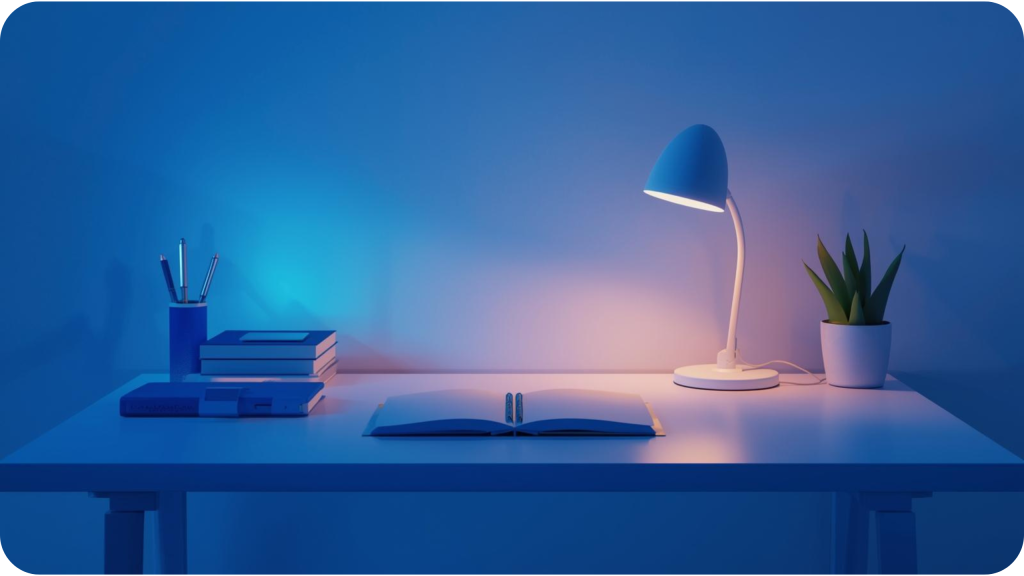
Simple ways to try blue in your space:
- A blue desk mat or mousepad
- Blue folders for your most challenging subjects
- A blue background on your digital devices during study time
🟢 The Balancing Effect of Green
Green spaces often feel naturally comfortable, which might explain why many people find them conducive to learning. Some research indicates that green could potentially:
📚 Reduce feelings of mental fatigue during long study sessions
🌿 Support reading comprehension
⚖️ Create a sense of balance that helps maintain consistency
Easy green additions to consider:
- A small plant on your desk
- Green elements in your room decor
- A green lamp or light filter
🟡 The Energy of Warm Colors
Warmer colors like yellow and orange bring a different energy to study spaces. While individual responses vary, some students find these colors helpful for:
⚡ Maintaining energy during review sessions
🎯 Highlighting important information
😊 Bringing a positive feeling to study time
Subtle ways to incorporate warm colors:
- Yellow sticky notes for key concepts
- An orange highlighter for critical information
- Warm lighting during evening study sessions
📚 Creating Your Personal Color Strategy
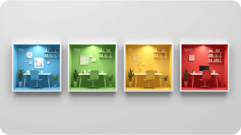
🎓 Matching Colors to Your Study Subjects
| Subject Type | Color Approach | Why It Might Work | Implementation Tips |
|---|---|---|---|
| STEM Subjects | Blue with green accents | Supports logical thinking and sustained focus | Blue main space with green plants or accessories |
| Reading-Intensive | Green with yellow highlights | Aids comprehension and maintains energy | Green background with yellow for key points |
| Memorization-Heavy | Yellow with blue organization | Supports energy for review with focus aids | Yellow for notes, blue for organization systems |
| Creative Subjects | Orange with green balance | Encourages innovation while maintaining grounding | Orange accents in a primarily green space |
🛠️ Building Your Color Environment Step by Step
Creating an effective study space doesn’t require completely redecorating your room overnight. Small, intentional changes often work best.
🎨 Phase 1: Observation and Planning
Start by paying attention to your current study experience:
📝 Week 1: Baseline Observation
- Notice which colors already exist in your study area
- Pay attention to how you feel during different study sessions
- Identify what’s working and what could be improved
🎯 Week 2: Color Experimentation
- Choose one color to test based on your primary challenges
- Implement it in a small, reversible way
- Observe any changes in your focus or mood
🎨 Phase 2: Implementation and Adjustment
A flexible, step-by-step plan helps you implement changes effectively without feeling overwhelmed.
| Timeframe | Action Steps | What to Observe |
|---|---|---|
| Days 1-7 | Add one main color element | Changes in initial focus and comfort |
| Week 2 | Introduce complementary colors | How different color combinations feel |
| Week 3-4 | Refine based on observations | Long-term effects on study consistency |
💡 Practical Implementation Table
Your available resources will shape how you implement these color strategies. The table below offers solutions for different budget levels.
| Budget Level | Color Solutions | Expected Impact |
|---|---|---|
| Low Budget | Colored stationery, sticky notes, small accessories | Subtle influences on organization and mood |
| Medium Budget | Desk accessories, lamps, small furniture pieces | More noticeable environmental influence |
| Higher Budget | Wall colors, larger furniture, custom lighting | Comprehensive environmental transformation |
⚠️ Important Considerations for Your Color Journey
🔍 Understanding the Limits
While color can be a helpful tool, it’s important to maintain realistic expectations:
🤔 Color is Just One Factor
- Learning success involves multiple elements
- Color works best alongside good study habits
- Individual responses vary significantly
🎭 Personal Preference Matters
- Your favorite colors might work better for you
- Cultural background influences color perception
- Past experiences shape your color associations

🌍 Cultural and Personal Differences
| Consideration | Why It Matters | How to Accommodate |
|---|---|---|
| Cultural Background | Colors have different meanings across cultures | Choose colors that feel positive to you personally |
| Personal Associations | Past experiences shape color responses | Notice how different colors make you feel |
| Visual Sensitivity | Some people are more affected by color | Adjust color intensity based on your comfort |
📈 Tracking Your Color Experiment
Implementing color changes is just the beginning—the real insight comes from observing how these changes affect your actual study experience.
🔄 Simple Observation Framework
Creating a basic tracking system doesn’t need to be complicated; it simply helps you notice patterns and understand what truly works for your unique learning style.
📊 The Weekly Color Journal
Consider keeping a brief journal where you note which colors were present in your study space each day. Alongside this, record your perceived focus levels during study sessions and track any shifts in your mood and energy throughout the week. These small notes can reveal powerful connections over time.
🎯 Using an Effectiveness Scale
To add clarity to your observations, you can create a simple 1-5 rating system for key areas of your study experience. This might include rating the ease of starting your study sessions, your ability to maintain focus, the overall comfort of your space, and how well you retain information afterward.
📝 Documenting Your Observations
A simple log, like the one below, can help structure your findings. The sample entries demonstrate how subtle variations in color can correlate with different states of focus and comfort.
| DATE | COLORS USED | FOCUS RATING | COMFORT LEVEL | NOTES |
|---|---|---|---|---|
| Monday | Blue desk mat | 4/5 | 5/5 | Felt calm and focused |
| Tuesday | Yellow notes + green plant | 3/5 | 4/5 | Good energy, slight distraction |
| Wednesday | Red corrections + blue background | 5/5 | 3/5 | Very focused but felt tense |
This process of observation turns subjective feeling into helpful guidance, allowing you to refine your environment based on your personal data rather than general suggestions.
🔮 Moving Forward with Color
Your journey with color in your learning environment is an evolving process of discovery and refinement. As you gather insights from your observations, you can begin to shape a more intentional and personalized color strategy that grows with you over time. This phase is about synthesizing what you’ve learned into a cohesive approach while remaining open to future adjustments.
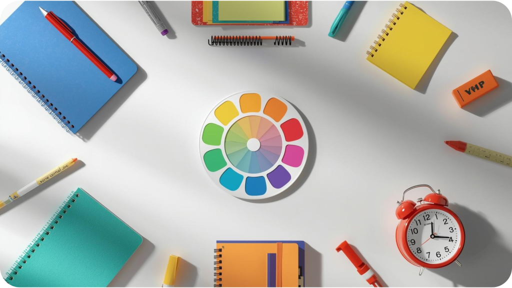
🌈 Curating Your Personal Color Palette
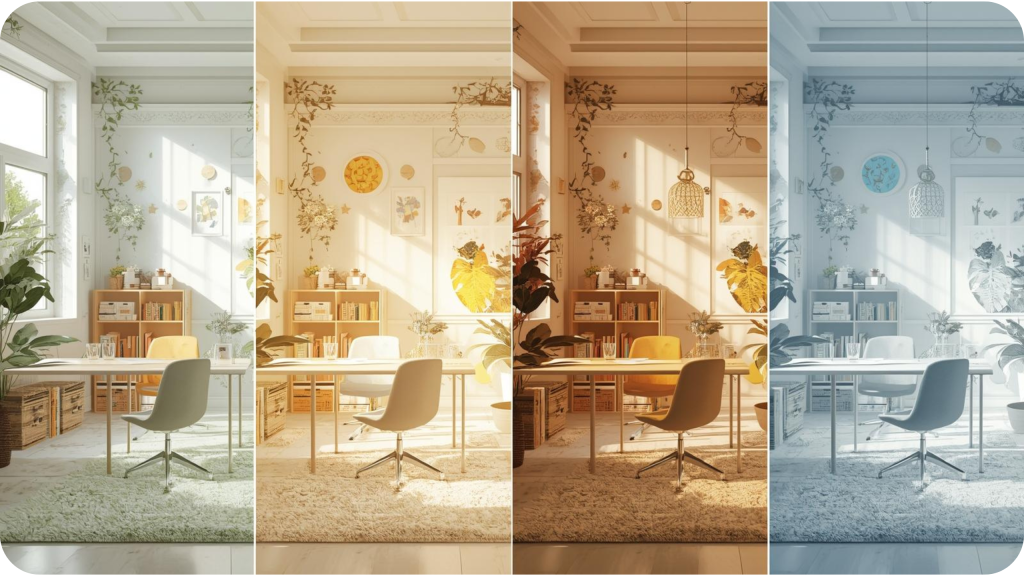
The transition from experimentation to implementation involves developing a consistent yet flexible color scheme that supports your academic routine. Start by identifying one or two primary colors that best facilitate your most common or demanding study tasks. These core hues will establish the foundational tone of your space, creating reliable visual cues that help transition your mind into a state of focus each time you sit down to study.
Once your primary colors are established, consider introducing complementary accent colors. These secondary hues serve specific purposes—they can inject energy when you’re feeling fatigued, provide visual separation between different subjects, or simply add a layer of personal appeal to your space. The key is to maintain a sense of visual harmony; aim for a balanced composition that stimulates concentration without overwhelming your senses. Pay attention to how colors interact in your specific lighting and how their proportions affect your sense of order and calm.
🔄 Embracing Continuous Improvement
An effective study environment is not a static creation but a dynamic one that should adapt alongside your changing academic responsibilities, personal preferences, and even the seasons. Your color needs may shift naturally throughout the year—you might find yourself drawn to warmer, brighter accents during the darker winter months to combat lethargy, or prefer cooler, more serene tones during intense exam periods to manage stress.
Remaining flexible allows you to tailor your environment to different subjects. A demanding calculus course might benefit from the focused calm of a blue-dominant setup, while a literature class requiring creative analysis might be better served by touches of green or yellow. Furthermore, acknowledge that your own tastes and optimal learning style will mature over time. Scheduling periodic check-ins with yourself about how your space is serving you ensures that your environment remains a true partner in your long-term academic journey, evolving as you do.
💫 Final Thoughts on Color and Learning
Creating a study space that works for you is a personal journey. Color can be a valuable tool in this process, but it’s most effective when combined with other good study practices and tailored to your individual needs and preferences.
The most important measure of success isn’t whether you’re following specific color rules, but whether your study space helps you learn effectively and feel comfortable while doing so. Experiment, observe, and adjust until you find what works best for your unique learning style and situation.
Most people need at least a week to determine if a color approach is helpful. Some effects are immediate, while others become apparent over time as you adapt to the environment.
Focus on what you can control. Adding colored accessories, using specific lighting, or incorporating colored organizational tools can still make a significant difference, even in a space with fixed colors.
Many color psychology principles relate to contrast and brightness rather than specific hues. Focus on creating clear visual organization and comfortable lighting that works for your visual perception.
Many students find that varying colors by subject helps create mental separation between different types of work. However, consistency can also be beneficial. Experiment to see what works best for you.


